This is a diary by Stochastic Democracy, evaluating our final forecasts for the 2010 House of Representative Elections and comparing our predictions to those of other forecasters. Cross-posted at DKos, where you can find the pretty version of the post– SSP doesn’t buy all the HTML code. EDIT: Okay, DKos doesn’t buy it either, check out the StochasticDemocracy frontpage for the good style.DailyKos post.
While there are still a couple of uncalled districts out there, enough returns have come in to start looking at the results and how the model did:
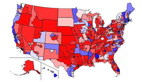
Behold our new Congress, based on provisional returns, colored according to Democratic Vote-Share. Compare with map on side-bar that shows our projections. 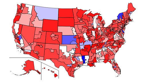
Swing in vote from 2008 to 2010. Red indicates districts where Republicans did better then last year, Blue indicates districts where Democratic standing improved, and White indicates no change.
Please click here to see a comparison of various predictions by John Sides of the Monkey Cage:
Stochastic Democracy predicted that Democrats would obtain 197 seats in the House of Representatives, 5 more than the currently projected outcome. This was the third most accurate forecast, 5 seats more accurate than FiveThirtyEight, and the most accurate one that also provided district-by-district vote estimates.
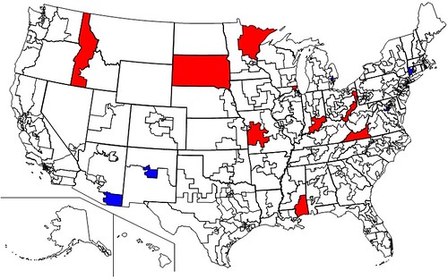
Red indicates the 10 districts that Democrats were predicted to win but did not, Blue indicates 5 districts Republicans were predicted to win but did not. White indicates the 418 correctly called districts, with 2 districts still uncalled (NY-25 (Maffei) and CA-20 (Costa).
Note that Dan Maffei currently looks likely to lose, which would add another miss to our tally, while Costa will almost certainly hang on, as projected by us.
While this method of grading makes our site look good, it’s not a very informative one due to two reasons:
1) Everyone could get a majority of seats right- not very hard to forecasts the outcome of elections in Manhattan or rural Nebraska. A map that gets 30 districts wrong, like Pollster.com seems to have done, would still be mostly white, despite a pretty underwhelming performance.
2) The record number of competitive districts this year. If you have a bunch of 50-50 districts, it’s basically a matter of luck how many of them you get right. That’s why sites like 538.com and us are doing probabilistic forecasts: We’re giving both candidates credit for having a shot to win the district for their side. Therefore, a much better way to evaluate forecasters is to look at how well they managed to predict vote-share district by district.
District by district, our model seems to have over-estimated Republican vote-share by about half a point. This is because the regression model appears to have inappropriately applied a uniform national swing to heavily Democratic urban districts- in downtown Chicago or New York, Democrats always win about 80-20, no matter what happens in the rest of the country, really. If we restrict ourselves to the 357 districts where the result was between 25 and 75%, the bias effectively disappears (4 hundredths of a percent toward the Republicans).
Mean absolute error was 3.2 points, while median absolute error was 2.6 points. This goes down to 2.8 and 2.5 respectively for the 25-75% districts.
But we provided full probability distributions as well as vote estimates for each candidate. It seems that our stated standard errors were quite accurate: 94.7% of results fell within our 95% confidence intervals. More generally:
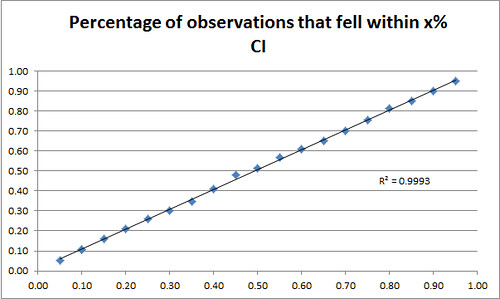
5.2% of results came within our 5% confidence interval, 10.6% in our 10% interval, etc.
In other words, our standard errors were well calibrated. Not only were we not wrong very often, but we were able to predict precisely how wrong we would be. That’s really amazing and can’t be stressed much enough: While most models really agree roughly on the mean of most predictions, they disagree heavily on how that should be converted to a percentage chance of winning. Nate Silver essentially had a very, very wide variance around his projections, so that he gave even candidates who were solidly ahead only a 70% or 80% chance of winning. We got the win percentage exactly right- about 95% of the candidates who we projected to have a 95% chance to win won, and the same is true for any other percentage.
We don’t have easily assessible data yet for the forecasts of FiveThirtyEight or Electoral-Vote, the only other forecasters we’re aware of who provided district level forecasts, and so we can’t yet replicate this analysis to see how our performance compares. On the other hand, Andrew Gelman, a renowned statistics professor at Columbia University, has looked at FiveThirtyEight’s forecasts and found that Nate’s confidence intervals were too wide:
So, yes, Nate’s forecasts do seem underconfident! There were 37 races where he gave the Republican candidate between 60% and 90% chance of winning, and the Republicans snagged all 37. Apparently he could’ve tightened up his predictions a lot.
We don’t think that looking at win-percentages solely is a fair measure, since most races are not close at all and race outcomes are not necessarily independent. Gelman agrees:
But . . . before jumping on Nate here, I’d suggest some caution. As we all know, district-by-district outcomes are highly correlated. And if you suppose that the national swing as forecast was off by 3 percentage points in either direction, you get something close to calibration.
Some other notes of interest:
Stochastic Democracy’s House forecasts were really a blend of two almost independent models: 1) A fundamentals-based regression model that took into account Incumbency, past election results, Income, Cook Ratings, and the Generic ballot adjusted for House Effects. And 2) A Bayesian state-space model that filtered polls, taking house effects, design effects, and potential industry bias into account.
The poll model shows that Democrats should have gotten 205 seats, while the regression model forecasted 186 seats. Paradoxically however, the poll model outperformed the Regression model in 52% of the individual races where polling was available.
Yet for races where polling and the fundamentals differed considerably, ID-1 (Minnick), AL-2 (Bright), MS-4 (Taylor), VA-9 (Boucher) etc (And CT-5 (Murphy) on the Dem side), the regression was considerably more accurate. There are a couple of theories as to why that could be, and it’s definitely something we’ll be looking at in the next couple of days.
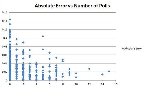
Absolute Error of our forecast in a district vs the Number of Polls in the District
One potential concern is if there is sufficient race-to-race correlation, then well-calibrated confidence intervals could in fact mean badly calibrated confidence intervals. See Gelman. More on this later.
Another graph:
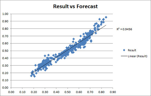
Our final race forecasts graphed against election results. For comparison, FiveThirtyEight and Pollster’s R^2 seemed to have been .73 and .55 respectively.